As we have finished filming all the footage we need, we are now putting together a final edit. The group is working on this together and we are all learning new skills. Some of the editing techniques we've learnt working on this project are;
Reversing footage so it plays backwards
IMAGE
As the main concept of our video is the reverse theme, it is important that we learned how to reverse footage properly. In some of the clips the footage in reverse looks a little strange so it needed to be sped up to stop it looking boring and out of place. Everyone knows how to do this and we are all making sure each group member gets a chance to try reversing footage.
Colour correction so each shot looks sharp
IMAGE
As we are not professionals using industry equipment, most of our shots are not well contrasted and look different to the rest. This is particularly evident in the lip sync shots from Neal's Yard where each shot has a different colour wall behind it. Our new technician Chris has taught us how to colour correct and contrast each shot properly so the video all fits together and has a glossy feel to it.
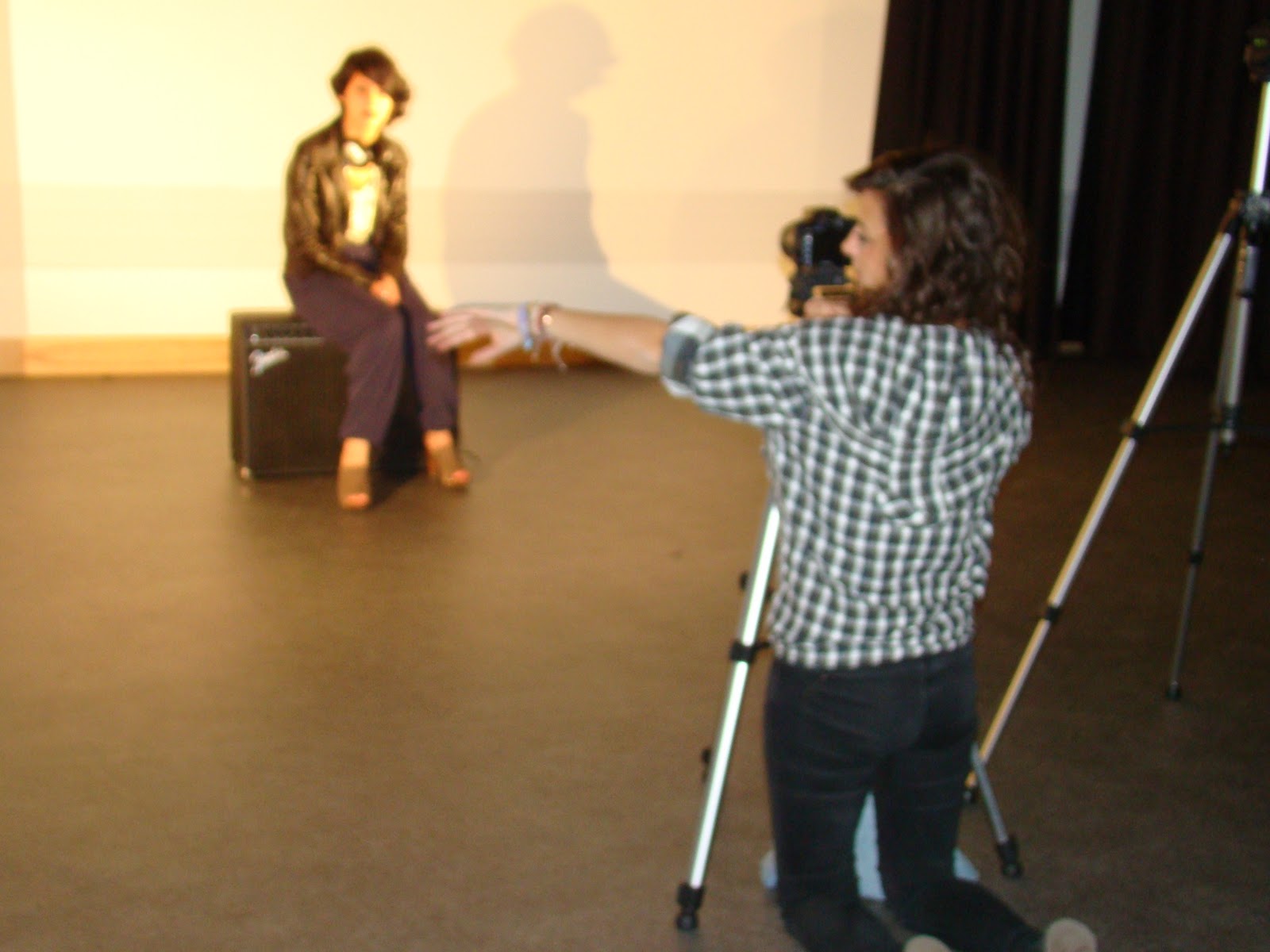
Editing the shots so everything is in time
IMAGE
As we are creating a music video, timing is essential. Because music videos do not follow the typical conventions of film (180 degree rule, continuity etc.) it is very important that the timing of the video is perfect. From our rough cut, we established that we were editing our footage so that shots were too long and drawn out which made it boring for the viewer and feedback from our audience confirmed this. To avoid this problem we are now editing the footage so that it cuts to the beat - this makes the video a lot more lively and fast paced which keeps the audiences attention and is much more suited to our genre.
Editing the lip sync shots so the artist sings in time
IMAGE
It is crucial that the lip syncing shots included in our video are edited so the artist sings in time with the lyrics - even if the footage is one frame out it is immediately noticable and reduces the standard of the video. It is a tedious job to make sure that every shot is in time to the lyrics and we are having to go through frame by frame to make sure it is perfect, but it will be worth it once we see the end product.