Here is our finished music video

Here is our finished music video

Click on the picture to view our finished website

Click on the picture to view our finished website
Click on the picture above to view our finished website

Here is our finished album cover

Thursday, December 16, 2010

Question 1

In what ways does your product use, develop or challenge the forms and conventions of media products?

We decided to film question one, and split the question into four parts. Despina and Anisah spoke about Carol Vernallis, Joe spoke about Andrew Goodwin and I spoke about the importance of the ancillary texts. Here is the video of me speaking about the album cover and website, I have also included the powerpoint we used for the analysis;


Evaluation Power Point


In the research stage of the project, we looked at the theory of Andrew Goodwin who states "music video demonstrates genre characteristics" and as a group we thought about this a lot when constructing our artist. To see how Goodwin's theory is applied, we looked at artists in the industry, and particular Lily Allen. The reason we chose Lily Allen was because she had an identity very similar to the one we wanted to create for Lexi Grace - she is flirty, fun, confident and, most importantly, very British.

Goodwin also claims that there is a very strong link between lyrics and visuals, a concept that we bared in mind for the entire planning process for our video. The key lyric that we used to demonstrate this relationship was "meddle with the mind" - we wanted this theme to come across throughout the whole video and through our use of reverse footage and choppy editing we created a mixed up world for our artist, and also for the audience watching it.


We created a lot of visual motifs throughout the product, something that both Vernallis and Goodwin talk about in their theories. Lexi's primary motif is the swallow that features on her grey jumper, with a secondary motif being her necklace - she plays with it during the video and is biting it on the front cover.


A voyeuristic appeal, mentioned in Goodwin's theory, also comes through in Lexi's video in order to attract a male audience. We wanted her lips to be a reference point and there are several shots of these in the video. Lips could be seen as a sexual connotation, they are an erogenous zone, but we didn't want the video to be too sexualised as she is a debut artist and we wanted to sell her music, not her skin. We also reference the famous 'Rolling Stones' logo, an image of a pair of lips with a tongue sticking out, continuing the lips reference.


Wednesday, December 15, 2010

Question 2

How effective is the combination of your main product and ancillary texts?

Our primary product was the music video and as a group we decided the most effective ancillary texts for our artist would be an album cover and artist website.


I think the combination of all three products we created worked really well in creating an artist identity. The video set up 'Lexi Grace' as a quirky, independent artist who followed certain conventions of the industry but also had a different side to her. Early on in the project we decided to use a reverse footage technique to add quirkiness to the video - it was a concious decision that fitted with the theme of the video and we were determined to ensure that the concept didn't backfire and look like a cheap way of filling time. From our audience feedback and the general reception of our video I think we achieved this, the reverse technique fits very well with the artist and the song and doesn't come across as doing it for the sake of showing off our editing techniques.

After establishing this quirky side to Lexi, we felt it was important to run this through the ancillary texts. The album cover both followed conventions and established an independent feeling, with only one image being used for the two inside panels - something that we had never seen done before. The front cover shot is slightly sexual as she is biting her necklace and half her face is covered by her hair suggesting promiscuity - this will attract males. As this is the artists debut album, it is important that her identity it established and she will be recognisable to her audience in future, and this shot achieves that.


We also developed a motif for Lexi, a silhouette of a swallow appeared on all texts including the music video. This helped the development of her identity, people will be able to recognise the swallow as Lexi iconography in the future and while we included it all of these products (all four panels of the album, the music video and the website), in future products it won't be necessary to include it as much.


To increase audience interaction on the website, we also created a Lexi clothing range. We were aware that it could quite easily turn into a cheap marketing strategy so we tried to make the clothing line as classy as possible. We used neutral colours like white, grey and black because this would be more appealing for the fans - we aren't aiming our artist at the typical 'girly girl' who would go for brighter colours like pink. We also set up a live 'buy now' link which directs to the paypal website.

In order to maintain a professional standard to our ancillary texts, it was important to use cross-platform marketing. Both the album and the website advertised each other and this encouraged the audience to buy into the artist brand. The URL address featured on the back cover of the album with the other industry information and gave the audience a chance to interact with the artist online. In turn the website had several links to download the or order the album and really highlighted that the album was available now.


The website also promoted the brand in other ways, for instance there was a live twitter feed and links to Lexi's myspace, facebook and youtube channels which furthers the interactivity of the artist and also adds a personal touch - allowing the fans to feel like they know the artist as she is talking to them via twitter. We looked a lot into real industry websites and realised that we should run a competition to win tickets to see Lexi, allowing the artist a chance to give back to her fans. The fans could also sign up to the website to have Lexi news sent to them via email and also allowing them to leave a comment on the site.


Tuesday, December 14, 2010

Question 3

What have you learnt from your Audience Feedback?

We filmed the reactions of our audience during the screening and also some responses to the video after and here is a video of those reactions;


We created an audience feedback form and this is an example of one that has been filled in by our audience;

Audience Questionnaire

Positive Feedback;
- Audience able to identify the artist as 'Lexi Grace'
- Most noticed the MTV logo and said they could see it on music channels like VIVA
- All rated the video between 7-10 which is a great response
- 90% of the audience said the video appealed to them
- Almost all the audience said they'd buy the single

What people thought worked well;
- The reverse shots such as the apple jumping out of the basket, the lipstick coming off and her jumping onto the postbox

- The audience thought the walking montage was effective and fitted well with the video
- The settings of the video seemed to be popular and people could easily identify it as London
- People likened the video to Pharcyde 'The Drop' and Coldplay 'The Scientist' which were the main inspirations for our reverse theme
- The quality of contrast especially the colours on the lip syncing/wall shots


The main thing that can be established from the feedback that we could have improved is that the lighting on some of the shots wasn't perfect and this was particularly noticeable next to similar shots with better lighting. Although we tried to colour correct the wall shots as best we could, this wasn't a substitute for using proper lighting equipment and if I had a chance to shoot again, I would definitely use pag-lights for close-up shots like this.


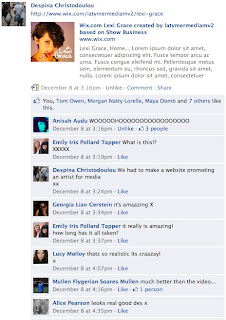
People responded really well to our artist's website, and when the live link was posted on Facebook so people could look at it, the feedback was fantastic. People said that they thought it looked like a professional website which was really good to hear after we put so much effort into it.


I think the feedback we received from our audience proved that we got the appeal spot on. The people who watched the video at our screening were our target audience and the fact that the lowest mark out of 10 we received was 7 proves that we successfully attracted our audience. However, it was also good to screen our video as it gave us a chance to see what we could have improved if we were doing the project again.


Here are two profiles of the audience we had aimed to target our product at;

Older Teenage Girls (16-19)

Likes and Interests; Shopping, Fashion, Spending time with friends,
Clubbing, Festivals and Concerts
Favourite Music; Pixie Lott, Lily Allen, Cheryl Cole, Pop
Favourite Websites; Facebook, Twitter, YouTube
Consumes Music; iTunes, YouTube, Radio


Teenage Boys (14-18)
Likes and Interests; Girls, Concerts, Going out with friends
Favourite Music; Dance and Electropop, Chart Music
Favourite Websites; YouTube, Facebook, NME
Consumes Music; File Sharing, Radio, YouTube 

Monday, December 13, 2010

Question 4

How did you use new media technologies in the construction, and research, planning and evaluation stages?


New technologyies have played a major role throughout our project, and from planning right through to post-production we have used a wide array of technologies. It has been really exciting working again with technology we have become familiar with over the last couple of years as well as new forms of technology that we have been introduced to in this project and it has given us new ways to produce, display and interact with our work.
To display our progress throughout the project we have used blogs, both individually and as a group. I find writing a blog post much more effective than writing progress down on a sheet of paper and it is a much more interactive way of working - allowing us to post pictures, videos and documents we have been working on throughout. It also gave us a way to communicate as a group, posting on the group blog and updating each other on what we've done individually.


Research + Planning

For the research and planning stage of the project, the internet was a very important tool to help us learn more about the conventions of music videos and to find a direction for ours. YouTube was very useful to us as we found a lot of inspiration for our reverse technique in videos posted on YouTube - both professional and amateur - and also inspiration from similar artists music videos.


Facebook was another great way of interacting with each other as a group. We were able to talk together and arrange meeting times. We also discussed possible problems such as the weather forecast for the shoot, without Facebook this would have been a much harder thing to do, phoning round and making sure everyone knew the same thing.


Production

When constructing our product, we used many types of technology; Stills Cameras, a HD Video Camera, Studio Lighting, Tripod and Editing software were just a few. We had used some of this equipment and software on previous projects but I feel the new techniques we learn on this project really advanced our ability to use them.
The camera we used to film our video with was a Canon HV30. It filmed in high definition which was extremely important for this project as we wanted to achieve the highest quality footage that was possible for our video and the richness and depth of shot that this piece of technology gave us really helped achieve this goal. It was vital that the colours in our video were vibrant and made the video come to life, and the quality of the camera allowed us to gain that effect.

A lot of shots we took during the production were stills of the artist, either singing or walking past the camera, and although a tripod is maybe not a new form of media technology, it was crucial to help us film those shots in a professional manner. We had used a tripod before so there wasn't much to learn about using them, but it was still a vital piece of kit.


Editing

After shooting the video, we had weeks of editing shots and piecing together the footage. The software we used for this was Adobe Premiere Pro, a programme we'd all used before. The software is relatively easy to use but there were techniques that we needed for this project that we hadn't used before and the whole group had to learn these new techniques;
  •  It was important that we maintained a similar contrast throughout the video and also that the colours throughout looked sharp and vibrant. To do this we learnt how to properly colour correct the shots and change the contrast for every shot. It was a long process but made the finished piece look a lot more professional.


  • In order to make sure the video wasn't monotonous and boring, we edited the shots so that most of them cut to the beat. This made the video a lot more choppy and interesting, making sure we kept the audiences attention. We also had a four-screen split screen at one part of the song, with each split appearing on each word - a technique that worked well and looked very effective.


  • The reverse footage theme was the most important effect througout our video and we learnt how to do this very quickly. Originally I thought it would be a hard technique to put into practice but in fact all it involved was taking the shot you wanted to reverse and going to the clip speed/duration setting and changing it to 'reverse speed'.


Ancillary Texts

For both the album cover photoshoot and the website photoshoot, we used a Canon 400D Digital SLR. We experimented with different lighting in the studio, using both the studio lights and the floor lights. This allowed us to get some very well lit shots, and even some with colour.


In terms of editing the photos, we used Adobe Photoshop, a piece of software that I have been a familiar with for years. We changed the contrast on some shots and used different layers to achieve different effects.


Website

To develop the website, we used a site called Wix. It was very user friendly and made creating our artists' website very easy. I learned how to create an industry style website from scratch and it was interesting to learn what goes into creating a website for a music artist. We created a flash based website that looked a lot more aesthetically pleasing than a myspace page or blog, and it actually looked professional!


The website works in synergy with other interactive platforms like Twitter, Myspace, YouTube and Facebook showing how technological convergence is important. This convergence is a recent thing, only coming about in the industry in the last couple of years so to involve this in our project added a professional feel.


Evaluation

We also used technology to advertise our official screening. The group created a Facebook event which we invited all our friends to - this is a much better way of raising awareness than word of mouth and also very relevant to our audience.

Friday, December 3, 2010

Audience Screening Preparation

To help us with our evaluation we are having an audience screening on Monday. We've created an audience feedback questionnaire and we will film the audience reaction.

This is our questionnaire;

To advertise our screening, the group has made a facebook event and invited all our friends from school. The screening's going to be at lunchtime so everyone will be able to attend and hopefully we'll have a big turn out.


Thursday, December 2, 2010

Music Video Signed Off

We've finally been signed off on our music video! After weeks editing our video, changing minor details and overcoming problems we've faced, Miss Blackborow has signed us off. The video has now been uploaded to youtube and next monday we are going to have a screening where we will collect audience feedback.